
Danske Bank were facing competition from new banks so were investigating ways to become the preferred bank in the marketplace. I guided this project from zero to one which launched across 4 countries.
Working with Research, Product Management, and Content Design teams I researched, designed and tested our B2C automated-decision lending solution. I worked on the end-to-end product design strategy, and designed the interface and prototypes.

9:41
Synthesising research
Synthesising research
Synthesising research
I created journey maps and personas which helped to communicate user goals and identify opportunities for improvement. This highlighted unmet needs - particularly around integrating with third-party accounting tools.


Journey Map
Journey Map
Journey Map
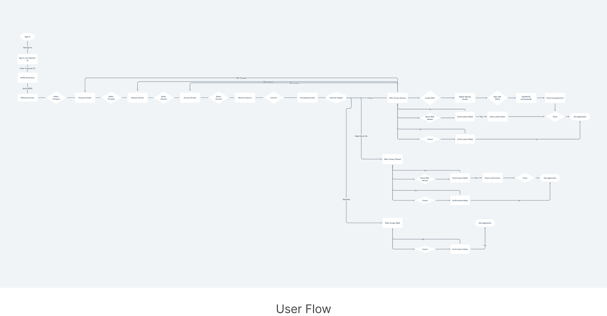
Navigation overview
Navigation overview
Navigation overview
I chose a stepped-form interaction model, because its frictionless on mobile, it's easier to comprehend information in smaller chunks, and this scalability could allow us to easily integrate new business logic or new features later on.
I worked with the engineering team to build a design system, since we had a uniformed layout to the design we could start building a lot of the basic component parts early in the dev process.
The uniform layout increases ease of use and each step of the application process is equally important.
Show me you know me
Show me you know me
Show me you know me
Customers want to be recognised, understood, and given relevant offers.
Using customer identification at log-in, the application would know customer account, business history, and display that data when it would be necessary.
I experimented with displaying with packaged lending offers that we relevant to that business size, and industry.
I spent a lot of time testing the UX tone of voice because some businesses felt we were speaking in too basic terms.


Designing for everyone
Designing for everyone
Designing for everyone
A lot of business banking customers consisted of middle-aged to senior users. The design therefore had to be big, and intuitive.
We used these big selector elements and emphasised input state changes and animated transitions that give feedback, provide navigational context and increase the ease of use.
I designed a 'share with an advisor' button so customers who want to speak to their advisor for help, or to negotiate their offer they could do it.

Fake friction
Fake friction
Fake friction
Also during usability testing, several users commented that the process felt like a 'quick loan', which has a negative connotation. So, I applied fake friction in the form of indeterminate progress spinner screens with fixed time delays so that users experience a slower application process.
For greater transparency around how the offer gets calculated, I used the loading screen space here to communicate to the user what was happening, i.e we're processing their request, evaluating their application, analysing their risk profile and creating the offer.
User testing improvements
User testing improvements
User testing improvements
We involved customers early on and every 2 weeks to validate design concepts.
In one round of testing, we learned that the tone of voice was too elementary, and the help text was too distracting, so we tweaked the tone of voice and used contextual tooltips to hide the distracting help text.
User feedback revealed that users wanted to experiment with their choices, and feel more in control. So, I decided to introduce navigational loops adding more controls that enabled users to feel free to edit their choices. I also decided against one style of progress indicators and chose another, dotted underline iconography worked better than text links.
We measured task success and task time. 9/10 people reached the end page, entering all the criteria correctly and with an average task time of 2 minutes.

Launch & results
Launch & results
Launch & results
For the visual design I wanted to reinforce trust so used our logo, and existing brand style since the blues, and the whites were so recognisably Danske Bank.
After 18 months we launched a self-service financing solution across 4 nordic countries.
With a lending limit of 100,000DKK and digital signing, customers could now access financing anytime, anywhere without the need for any manual processes.
The timeframe for which customers could now apply for and get money in their account was reduced from 2 weeks to 2 days.
In the first week of the beta launch, the solution had:
⭐️ 15 cases run through the system.
⭐️ 6 cases completed end-to-end 100% digitally
⭐️ 3 cases were supported by a relationship manager
⭐️ Over 1 million DKK lent with really positive feedback
Danske Bank were facing competition from new banks so were investigating ways to become the preferred bank in the marketplace. I guided this project from zero to one which launched across 4 countries.
Working with Research, Product Management, and Content Design teams I researched, designed and tested our B2C automated-decision lending solution. I worked on the end-to-end product design strategy, and designed the interface and prototypes.
9:41
9:41
£1,557.35
TOTAL BALANCE
11% vs Monday last week
£75
£50
£25
£0
Yesterday
Today
06:00
12:00
18:00
24:00
Activity
See all
-£4.75
Debit
11:31
£3.00
Credit
11:37
£3.00
Debit
11:37
£2.50
Debit
12:02
Ocra stores
Summary
Transactions
Billing
Account
£1,557.35
TOTAL BALANCE
11% vs Monday last week
£75
£50
£25
£0
Yesterday
Today
06:00
12:00
18:00
24:00
Activity
See all
-£4.75
Debit
11:31
£3.00
Credit
11:37
£3.00
Debit
11:37
£2.50
Debit
12:02
Ocra stores
Summary
Transactions
Billing
Account
Navigation overview
Navigation overview
I chose a stepped-form interaction model, because its frictionless on mobile, it's easier to comprehend information in smaller chunks, and this scalability could allow us to easily integrate new business logic or new features later on.
I worked with the engineering team to build a design system, since we had a uniformed layout to the design we could start building a lot of the basic component parts early in the dev process.
The uniform layout increases ease of use and each step of the application process is equally important.
Show me you know me
Customers want to be recognised, understood, and given relevant offers.
Using customer identification at log-in, the application would know customer account, business history, and display that data when it would be necessary.
I experimented with displaying with packaged lending offers that we relevant to that business size, and industry.
I spent a lot of time testing the UX tone of voice because some businesses felt we were speaking in too basic terms.
Designing for everyone
A lot of business banking customers consisted of middle-aged to senior users. The design therefore had to be big, and intuitive.
We used these big selector elements and emphasised input state changes and animated transitions that give feedback, provide navigational context and increase the ease of use.
I designed a 'share with an advisor' button so customers who want to speak to their advisor for help, or to negotiate their offer they could do it.
A lot of business banking customers consisted of middle-aged to senior users. The design therefore had to be big, and intuitive.
We used these big selector elements and emphasised input state changes and animated transitions that give feedback, provide navigational context and increase the ease of use.
I designed a 'share with an advisor' button so customers who want to speak to their advisor for help, or to negotiate their offer they could do it.

Fake friction
Also during usability testing, several users commented that the process felt like a 'quick loan', which has a negative connotation. So, I applied fake friction in the form of indeterminate progress spinner screens with fixed time delays so that users experience a slower application process.
For greater transparency around how the offer gets calculated, I used the loading screen space here to communicate to the user what was happening, i.e we're processing their request, evaluating their application, analysing their risk profile and creating the offer.
User testing improvements
User testing improvements
We involved customers early on and every 2 weeks to validate design concepts.
In one round of testing, we learned that the tone of voice was too elementary, and the help text was too distracting, so we tweaked the tone of voice and used contextual tooltips to hide the distracting help text.
User feedback revealed that users wanted to experiment with their choices, and feel more in control. So, I decided to introduce navigational loops adding more controls that enabled users to feel free to edit their choices. I also decided against one style of progress indicators and chose another, dotted underline iconography worked better than text links.
We measured task success and task time. 9/10 people reached the end page, entering all the criteria correctly and with an average task time of 2 minutes.
Launch & results
For the visual design I wanted to reinforce trust so used our logo, and existing brand style since the blues, and the whites were so recognisably Danske Bank.
After 18 months we launched a self-service financing solution across 4 nordic countries.
With a lending limit of 100,000DKK and digital signing, customers could now access financing anytime, anywhere without the need for any manual processes.
The timeframe for which customers could now apply for and get money in their account was reduced from 2 weeks to 2 days.
In the first week of the beta launch, the solution had:
⭐️ 15 cases run through the system.
⭐️ 6 cases completed end-to-end 100% digitally
⭐️ 3 cases were supported by a relationship manager
⭐️ Over 1 million DKK lent with really positive feedback